January seems like a rather serene month. There’s lots of white out the window and the colors of Christmas have faded away. Sometimes I imagine what it would be like to get married right now, or even plan a fabulous dinner party. Lots of candlelight and coziness seems appropriate yet, but I’m over the glam of the holidays and seek a little more simplicity.
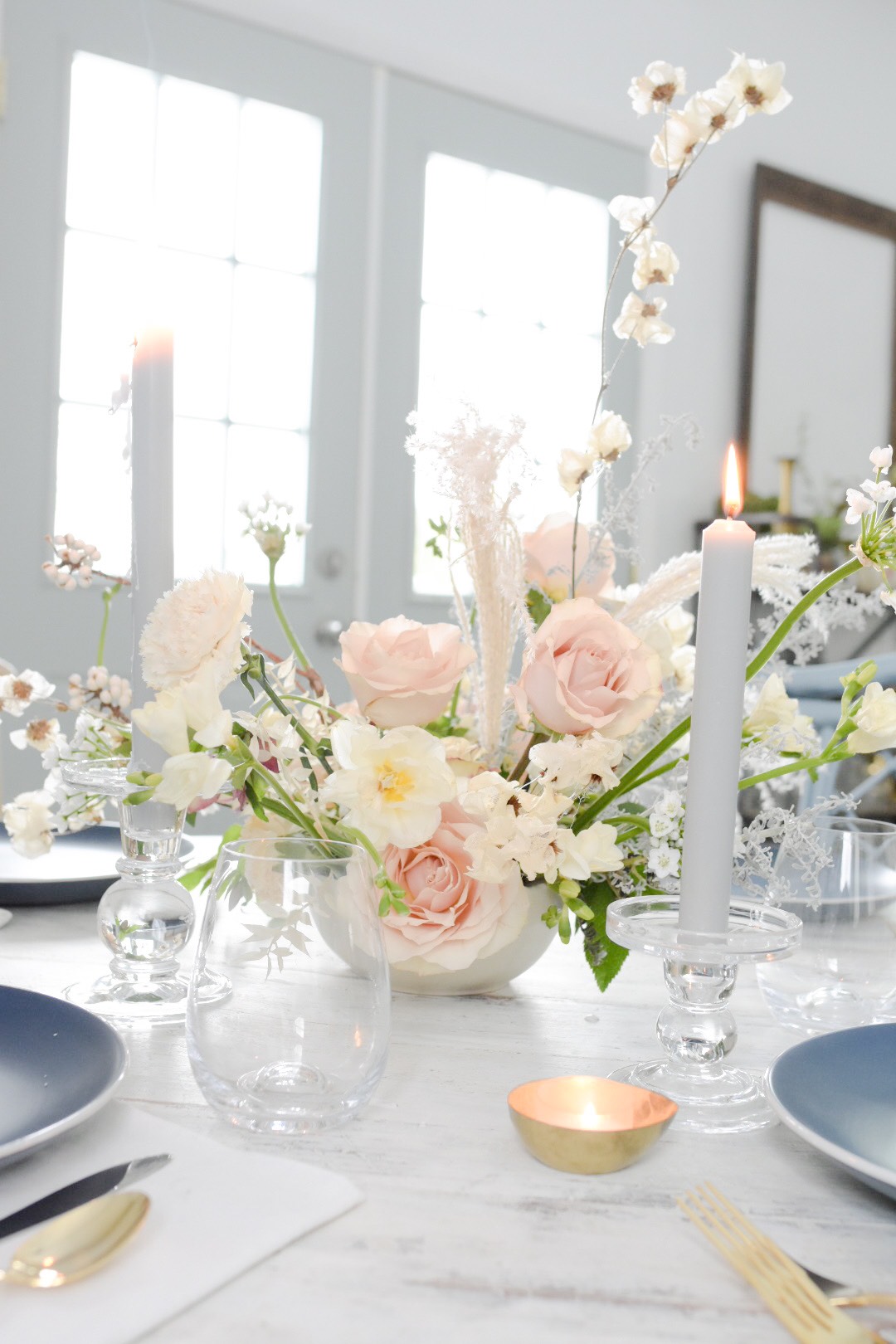
Earlier this month, I shared a few great January flower options. But I wanted to extend that further, digging into exactly how to use those flowers not only to make a stunning centerpiece or arranmgent, but also a tabletop to go along with it.
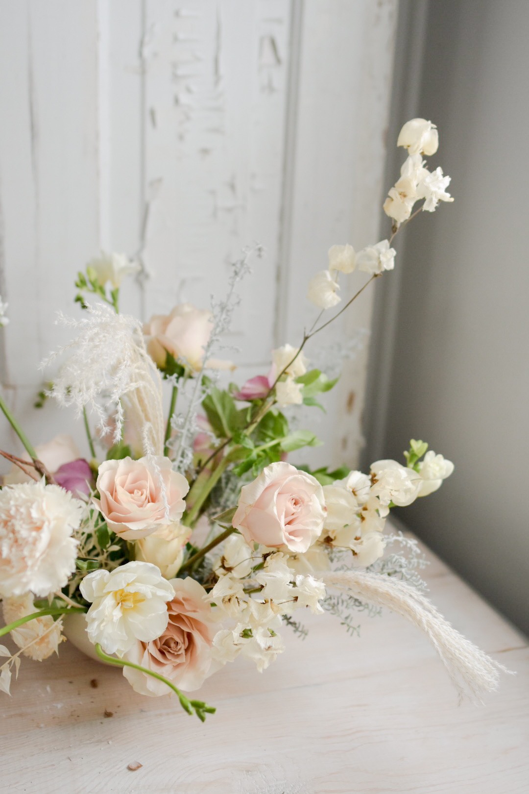
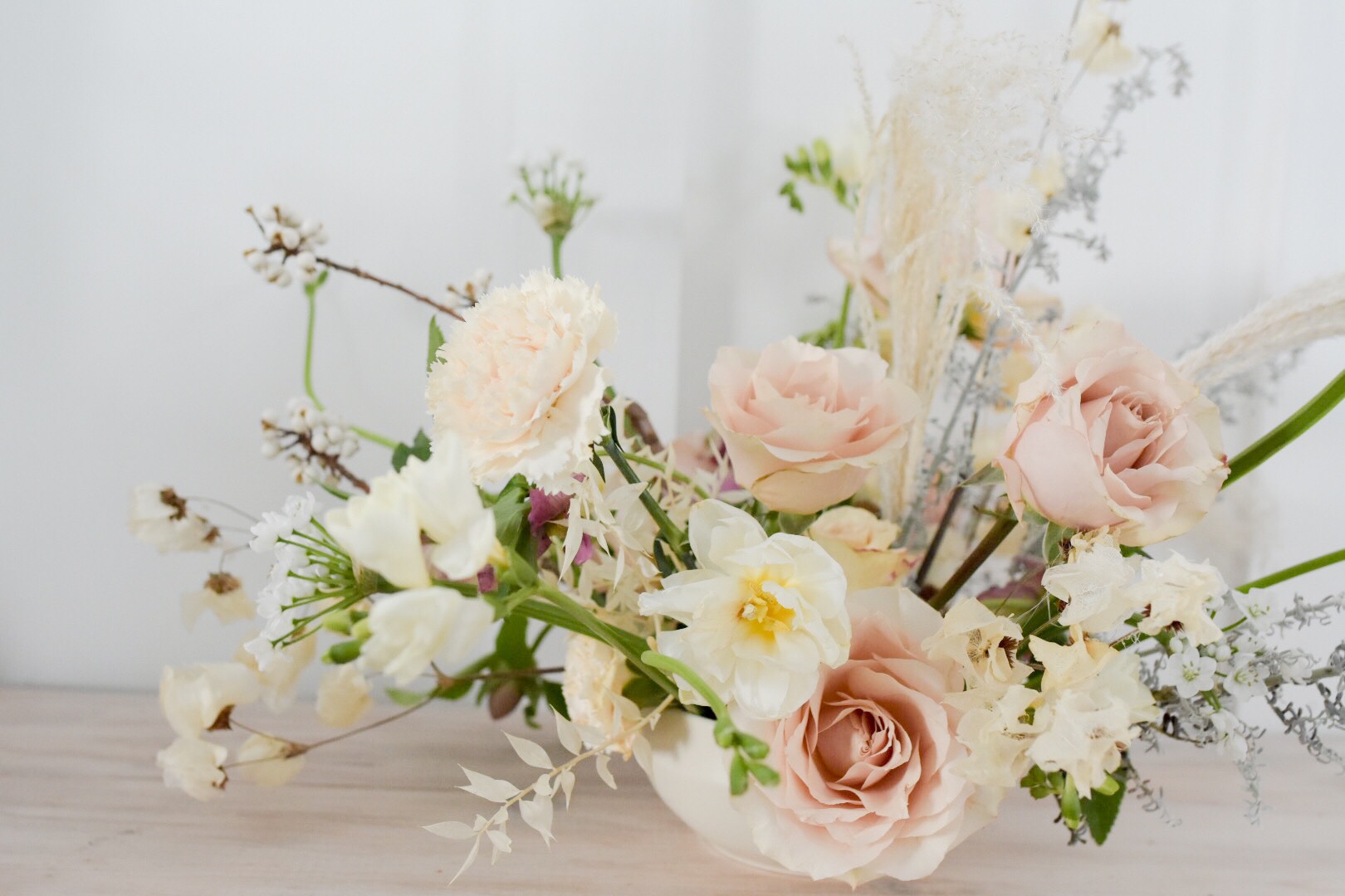
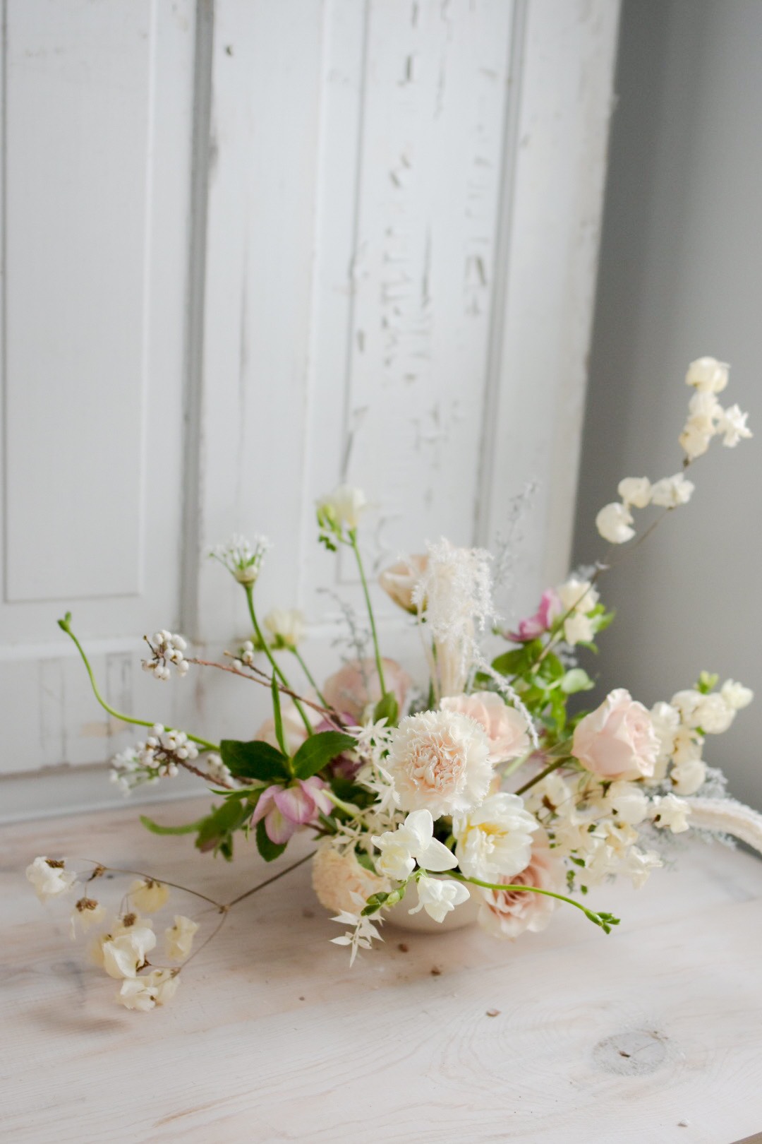
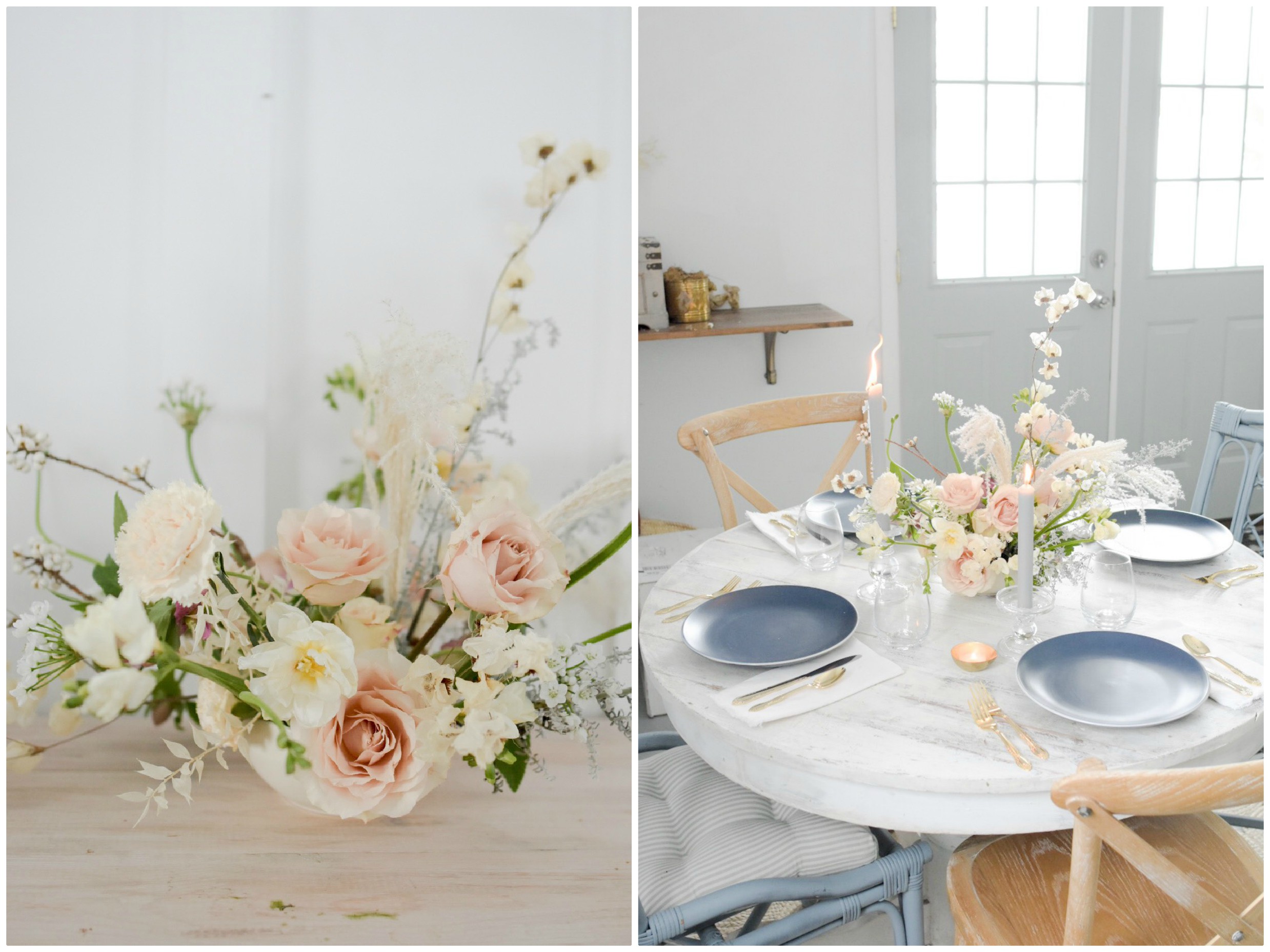
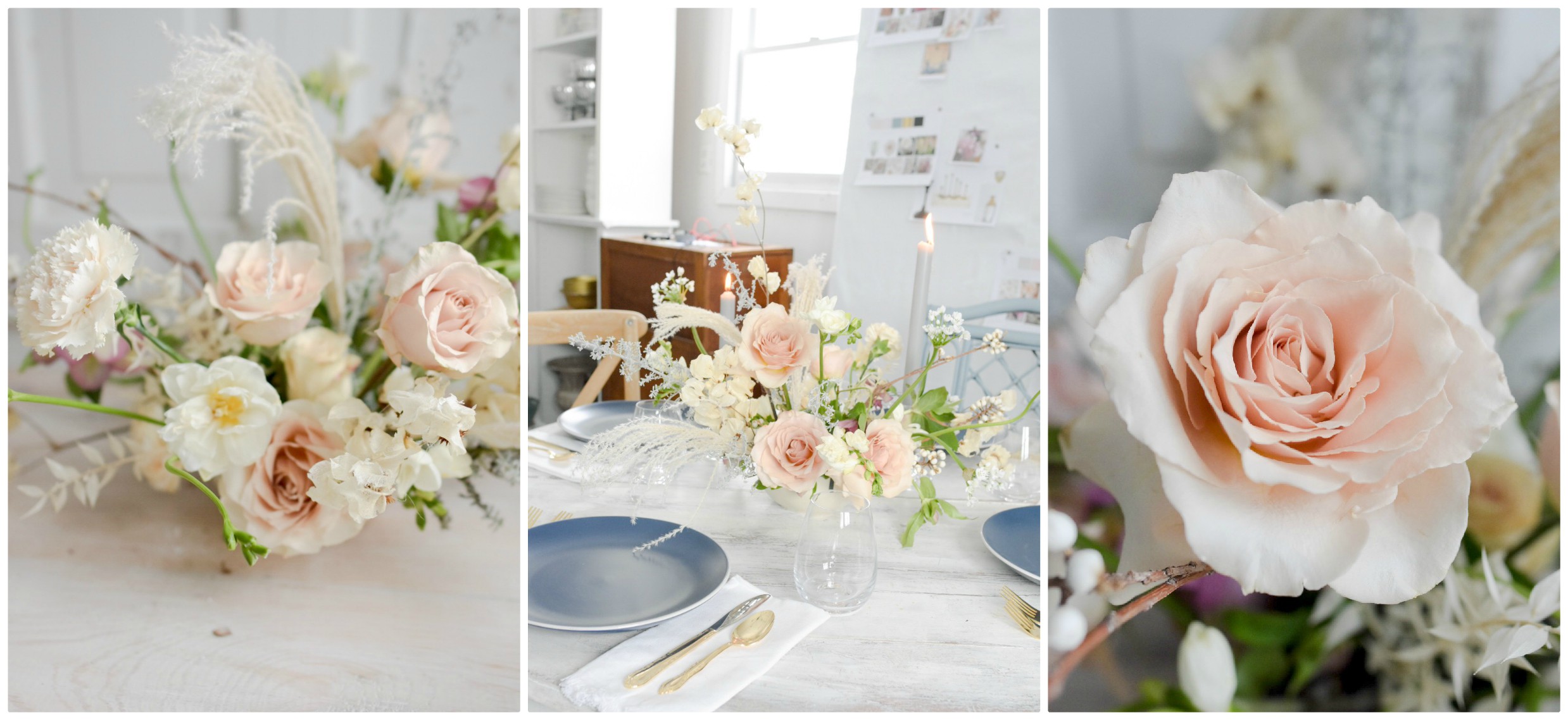
I did add a few other flowers, beyond the 5 previously mentioned (in the post here) – white allium, dried bougainvilla, hellebores, kochia and quicksand roses. I think dried bits and textural pieces are great in any season, but especially right now. I have a hard time creating a nautral arrangment that doesn’t a least somewhat mimic what’s happening outside. And outside is very much lacking greenery.
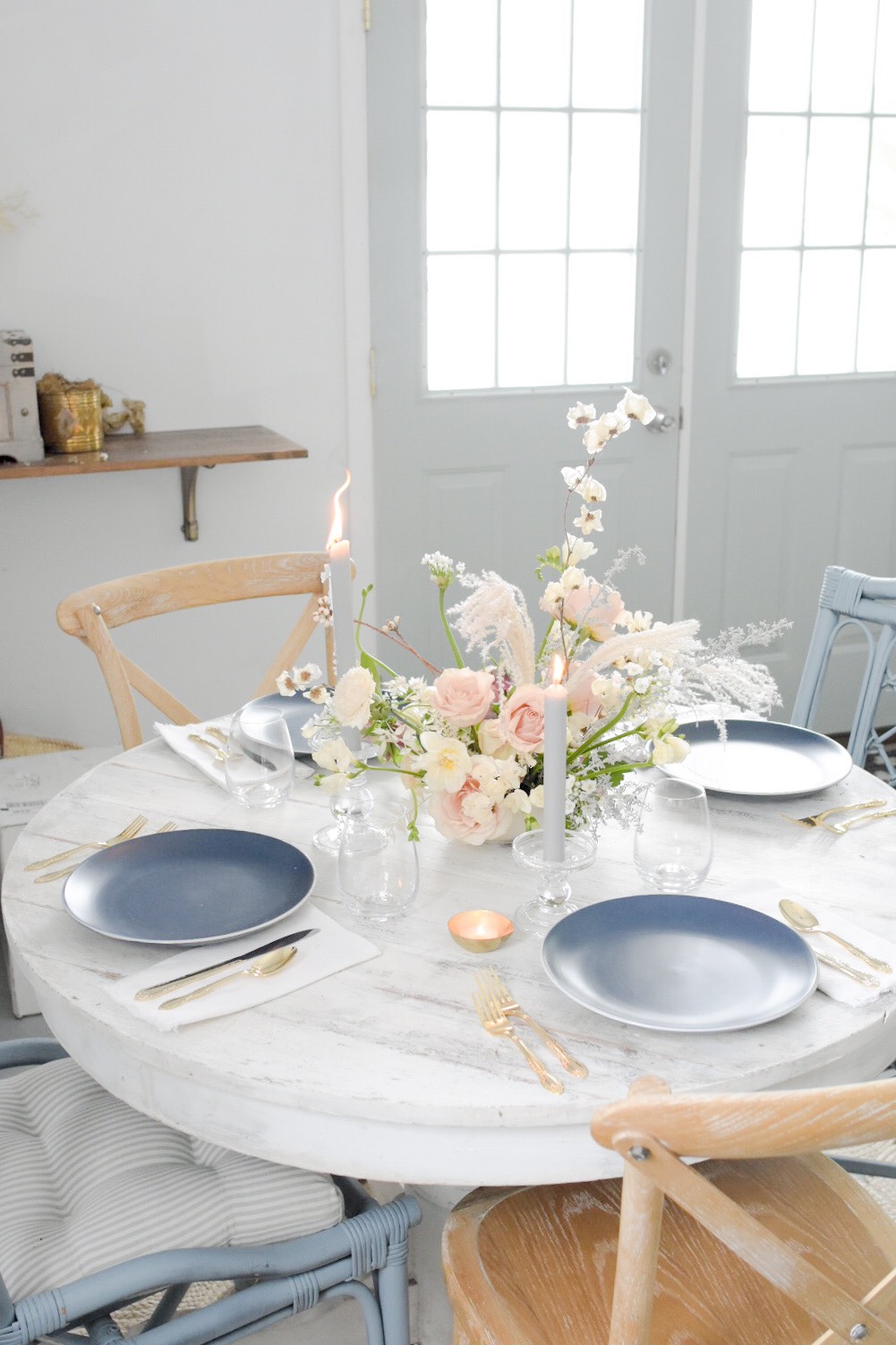
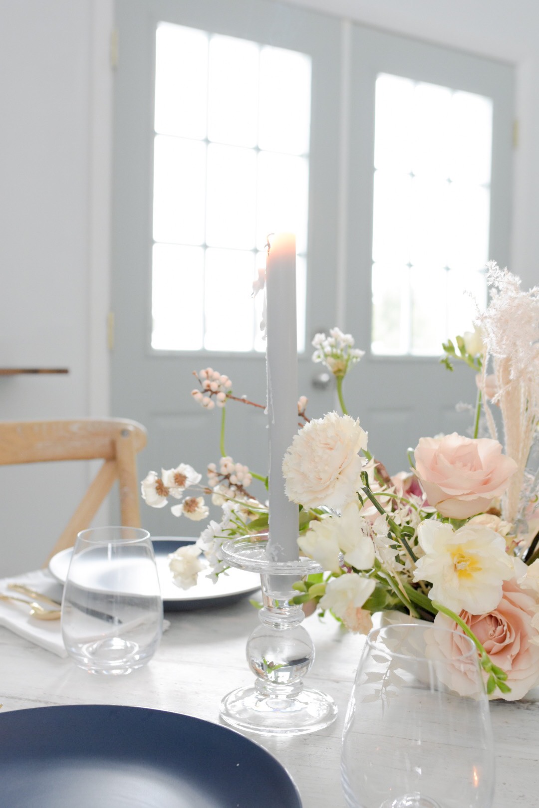
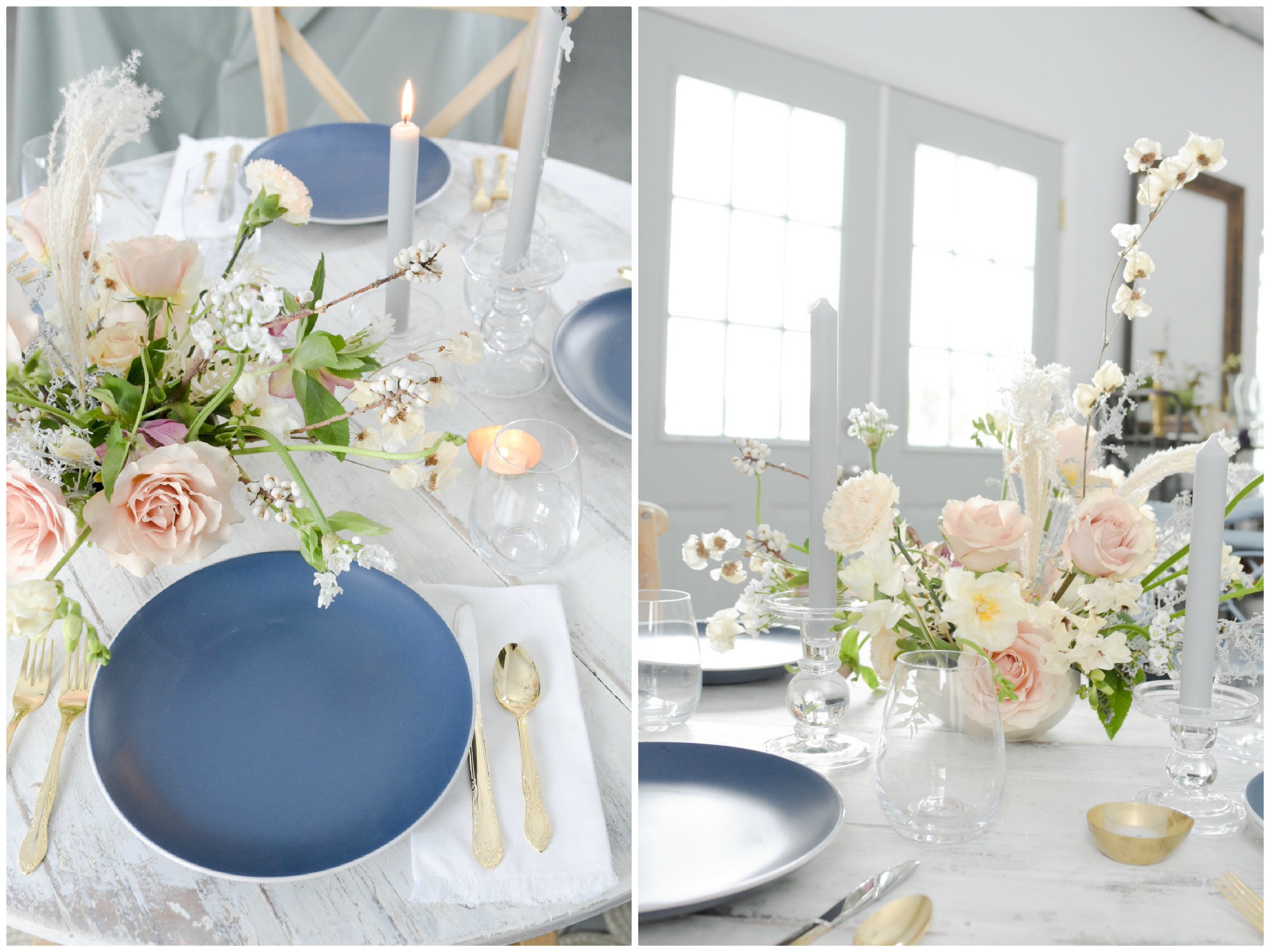
I wanted to pair this combination with blue. Pink and blue have been a common pairing for awhile now, we saw Panatone choose the two together a couple years back and now blue has once again surfaced as the color of the year – although it’s a much brigher hue this time around. Perhaps it was the cold weather that has me thinking blue, or just the fact that I love these simple and sleek dinner plates and was determined to find a way to use them. Either way, I really liked how the white and subtle blushy pink tones of the centerpiece, the deeper blue plates and then adding in some soft blue candles really pulled these entire tabletop together. The clear glassware and candle holders made me think of ice, another nod the to weather. To top it off, I added in some gold flatware, just dress it up a bit and contrast against the more rustic, whitewash of the wood table.
A couple more thoughts to consider if you’re thinking of recreating this look-
These photos were taken in my studio, which is surrounded by lots of white and natural light. This could definetely come across a little more moody and beautiful in a darker setting – but I could recommend adding a few more candles.
Navy can photograph lighter – depening upon your photography style. These plate aren’t a true, deep dark navy blue, but in person read a little more navy than these pictures would have you believe. The light of the studio reflected off of them for photos and the flowers seem very true to color but not the plates. I’ve used navy ribbon for bouquets in the past and gotten photos back that looked as though bridesmaids were carrying posies wrapped in royal blue. Just a little note to consider as you’re designing, choosing photographers and pairing colors and settings all together.


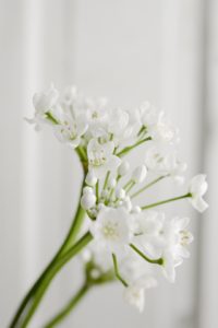
 I’ve coveted these little blooms in other designer’s work for years. I see it growing up fences and charming stone buildings. But, it’s not available in Michigan and does not have the tolerance for shipping, until now. This delicate little guy has been dried and is now the perfect little textural tidbit for an arrangement. The shape of the flower and overall look when placed in an arrangment is similar to a sweet pea, but we don’t have to worry about freezing them in the chilly January air and the color is more creamy, rather than a true crisp white. It warms up a winter arrangement, while still complimenting the landscape outside.
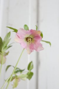 Also referred to as a Lenton Rose, these little guys are one of the first ones to spring to life in the garden. I’ve heard of them popping up and blooming through the snow, although I’ve personally never had that experience in my own garden. They are a great winter flower option though, not only because of the season, but also the subtle color they add to an arrangement. They’re mainly found in shades of pink, purple, green and white. The a single bloom usually contains more that one hue, creating a natural ombre effect and I simply love any flower that won’t define itself as just one color. Second bonus point for this little bloom, the colors are usually more on the antique scale which will appeal to those of us who like color, but not when it’s loudly screaming in your face.
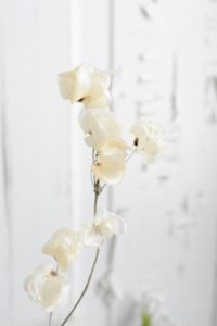
 This is a new one to me, I saw it on my wholesaler’s list and thought I’d give it a try. I loved the texture and silvery color. Silvery green foliages are extremely popular, definately in the winter months, but really the entire year through. I’m always on the lookout for new ones to replace the ever popular dusty miller which everyone seems to love, but I personally have very little luck with. This is more delicate and textural adding just a touch of silver to an arrangement and making a really great, sturdy and linear, frosty option.
 My favorite of the standard roses, the quicksand rose. She’s hardy, dependable and opens up beautifully. She’s the perfect neutral, blending with pinks, white, beige and more golden hued flowers. Its the subtle way that she takes control of an arrangment that really makes me love her even more. She’s popular any time of year, although her availablity becomes a little more scarce during the summer months, due to the high demand.


 Photography: