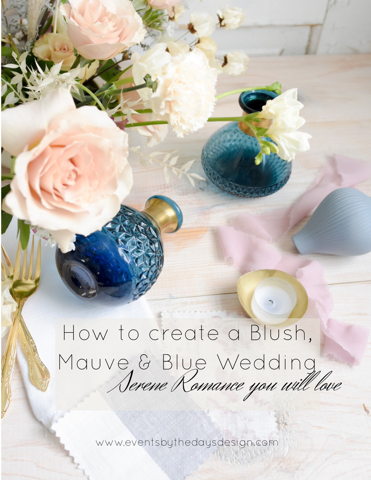
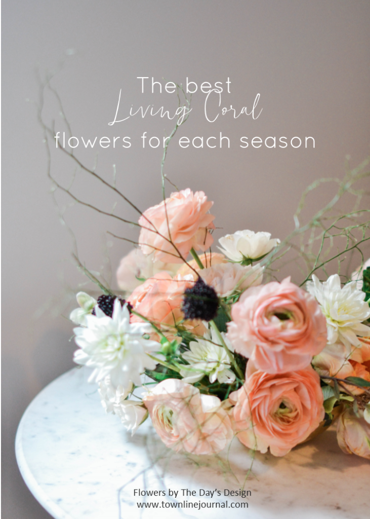
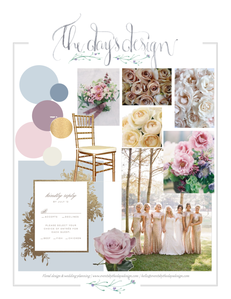
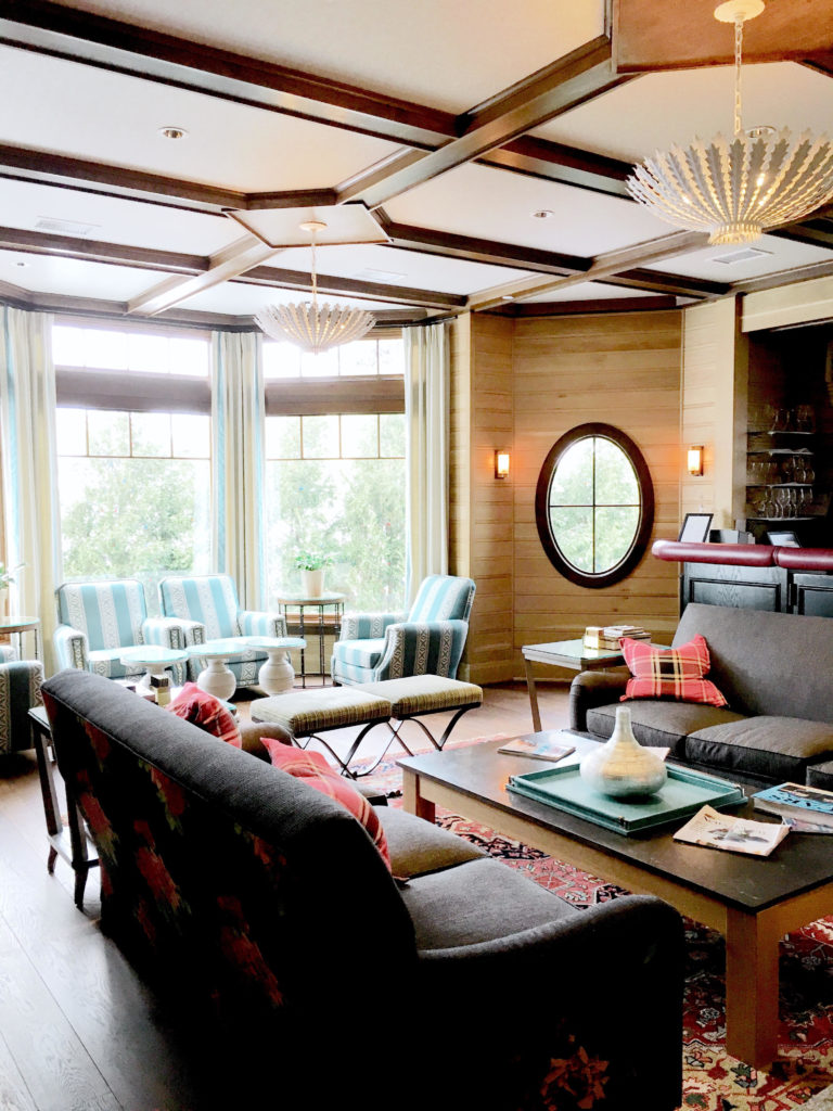
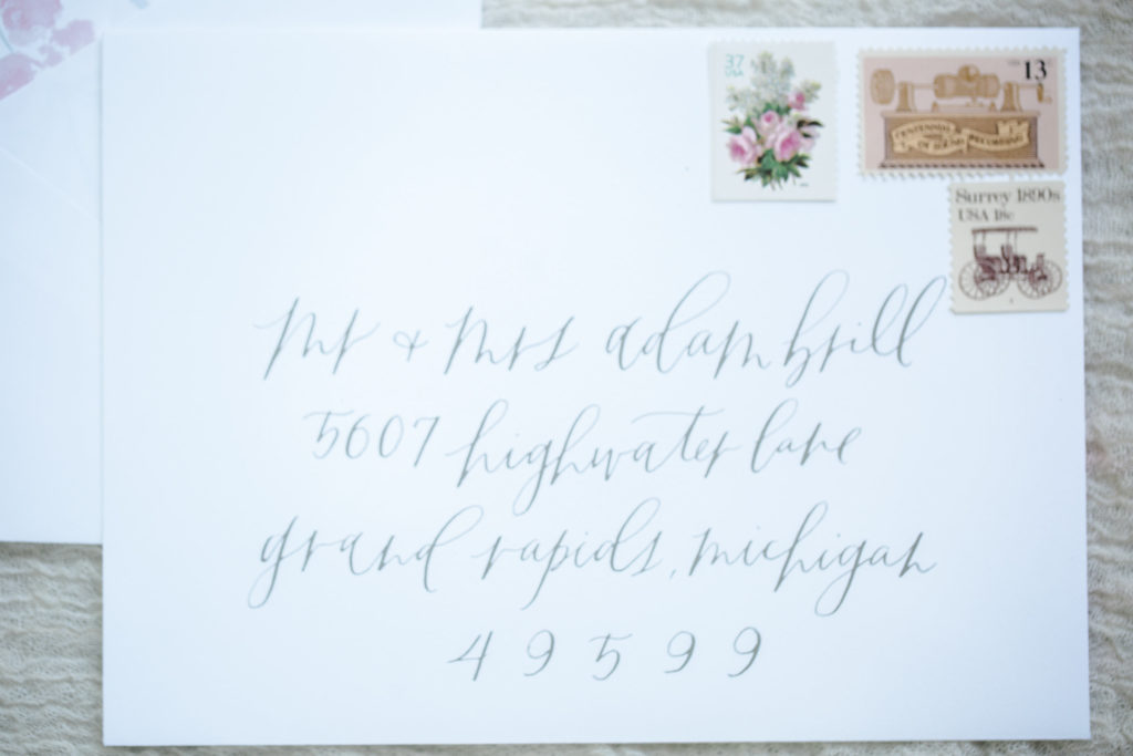
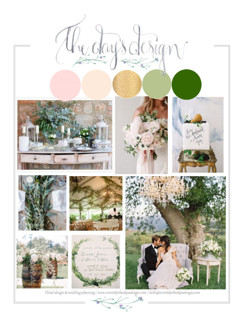
Colors I’m seeing a lot of this year aren’t too far off from what I’ve been working with in previous years. Still lots of blush, which seems to morph a little more into mauve and blue. Lots and lots of blue. Now living by the lakeshore, I’m not sure that blues will ever completely fade away. And I’m completely okay with that.
Obviously there are hundreds of different ways to go about using these colors. Bridesmaids dresses, table clothes, napkins, ribbons, soft seating, flowers… the list goes on. Often I think one of the biggest struggles when trying to piece together the various parts of your event decor is understanding what’s actually available from shops or rental places near you. We see lots of inspiration image floating around in magazines and online, but sometimes it’s just one tabletop or dinner party being shown. Figuring out how to recreate that on a larger scale, when you have 20 guest tables can be a bit more challenging. It might look really cool to have a bunch of handmade custom vases from a local artist on the table (and I completely support shopping local!) but at $25-75 each or more, that’s not always easily achievable for an entire celebration.
The other challenge is knowing how to balance the colors. How to make it make it feel like a peaceful, serene and utterly romantic wedding day (which is how I personally percieve this color comb0) rather than just splashing these 3 colors in every which direction. Chosing an item simply because it fits with your color scheme isn’t always the best idea. Things can start to feel polka-dotted or overwhelming… and planning a wedding is overwhelming enough!
My goal is to show off pieces in my inventory, or available from companies that I regularly work with, to bring the event vision to life.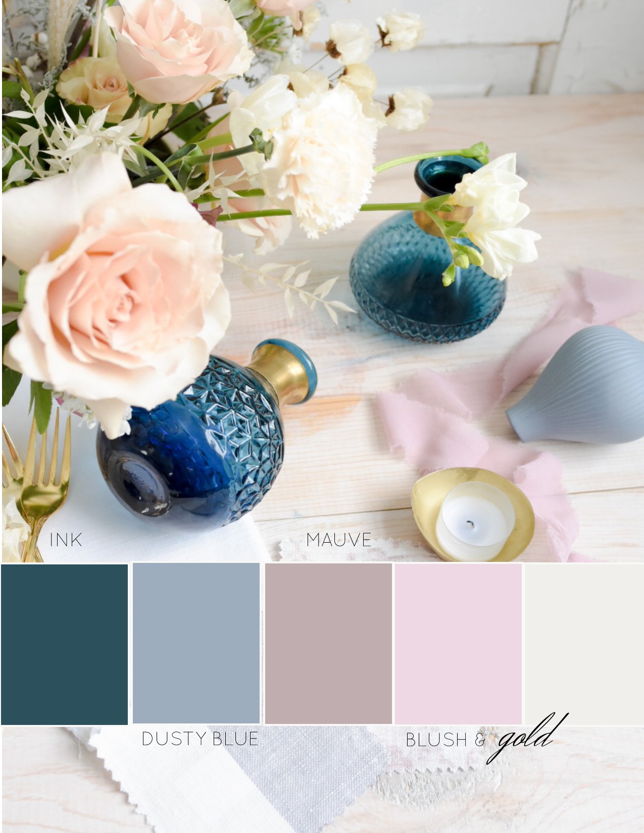
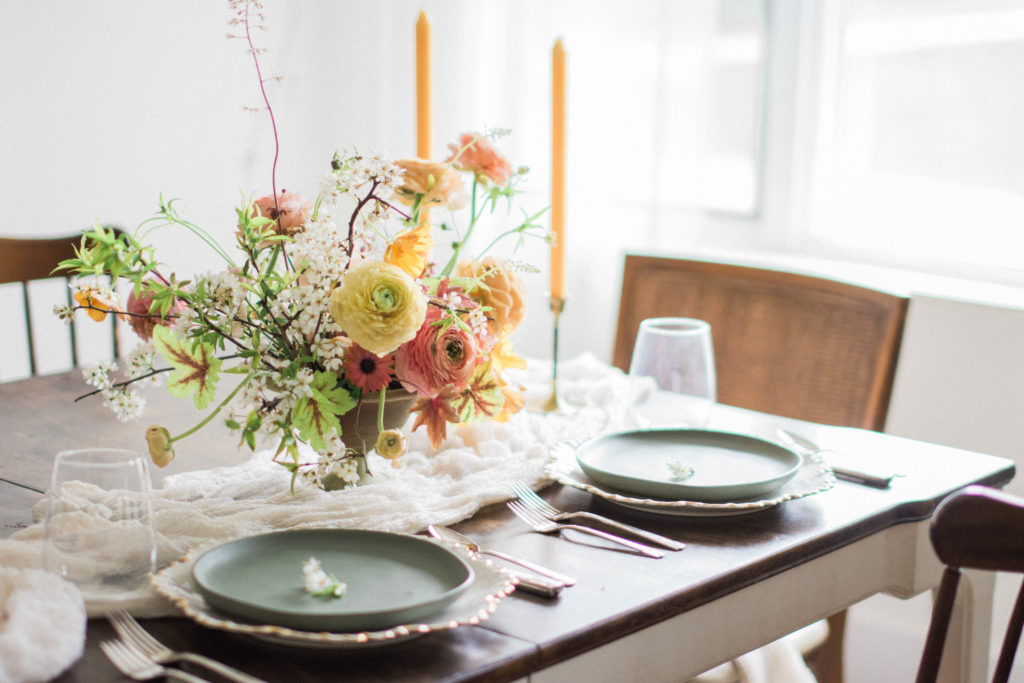
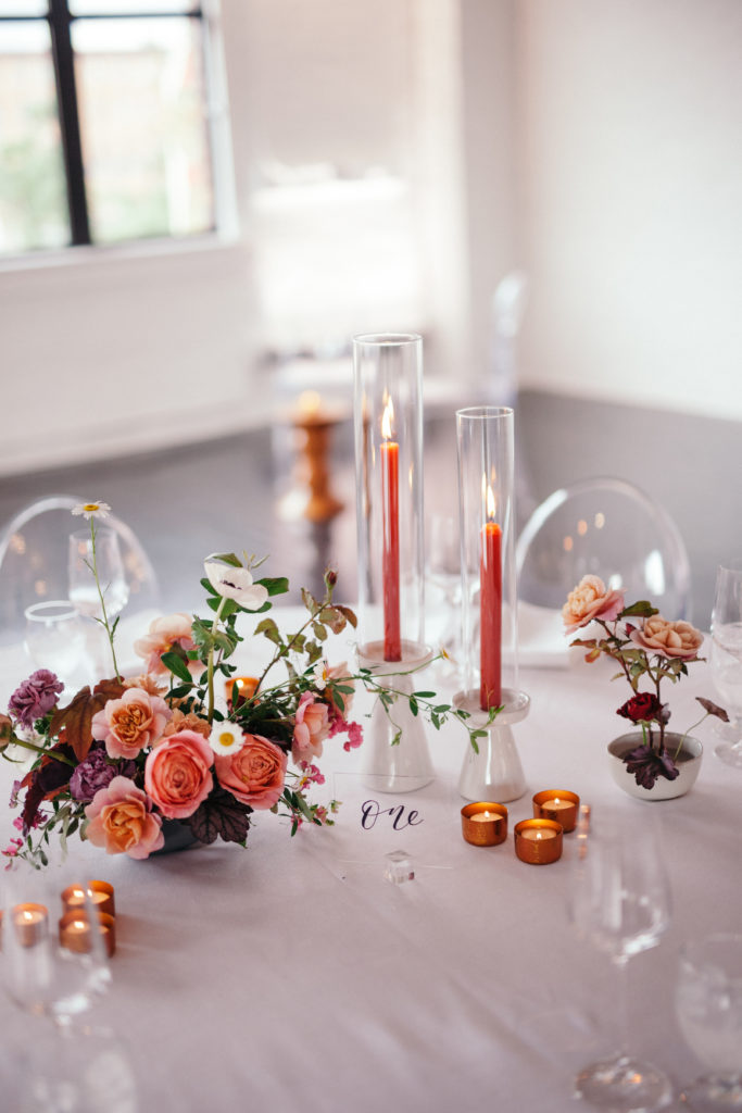
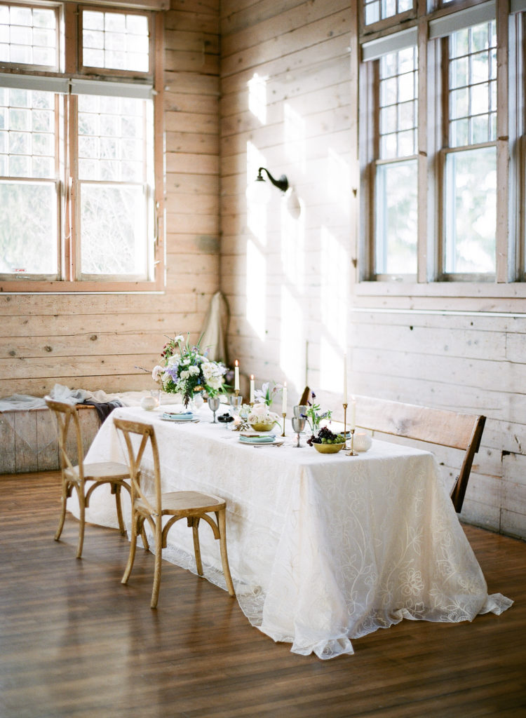
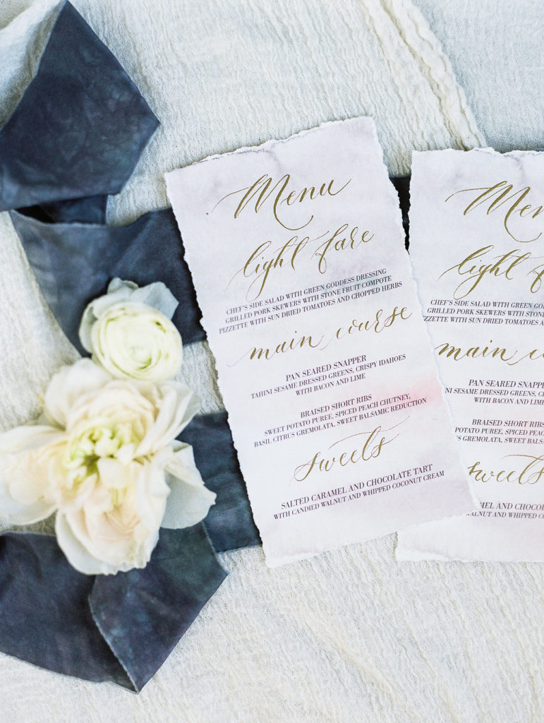
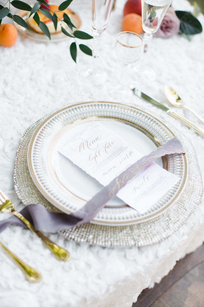
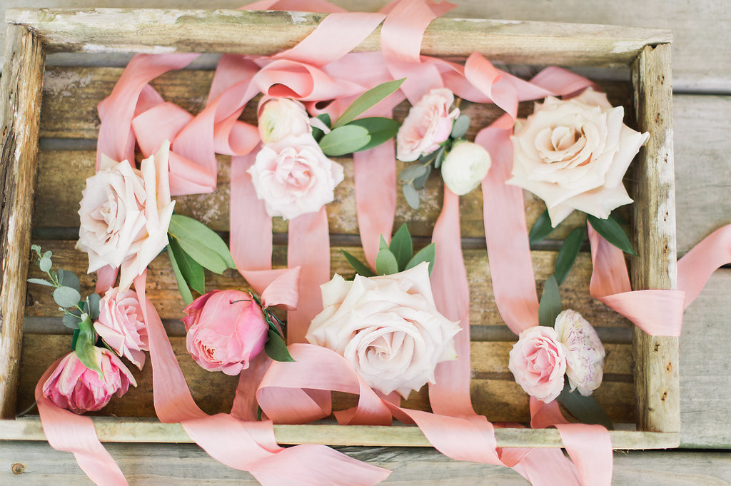
We’re starting with a pastel or neutral linen. I’m suggesting a patterned one, but not too bold. Then pairing it with a simple white napkin. Depending upon how busy the reception space is, you could replicate this look on all the tables or even invert the design, creating some tablescapes with solid linens and using the patterened napkins. Overall though, I love the look of a textured or slightly patterned linen and the way it enhances the overall look of the reception. If I had to place a first place vote, it would be using this patterened linen that says blush, but also leans mauve. It’s a little classic without being old school The texture is classy and earthy all at the same time.
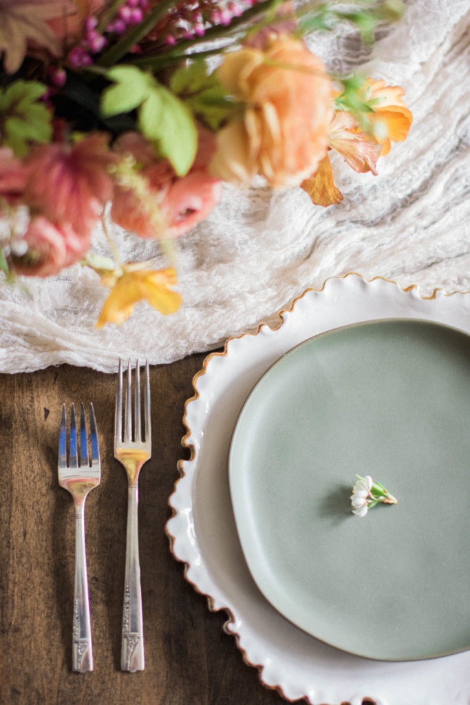
Vases and vessels are not always the statement pieces of a room. But for this look, I’m suggesting using a bold navy and slate tones which will add in the blue to our color scheme. The blue glass vases will give a classic, timeless appeal but pairing them with the slate blue ceramic ones will give it a modern edge. Of course this only translates to budvases in my personal inventory, I’d most likey just use a simple white or gold vessel for my more classic compote style centerepieces.
Next I want to layer in modern gold flatware, for a couple reasons. First off, I love the way it ties in with the gold on the navy glass vases. Secondly, gold flatware always feels fresh, like an extra layer of thought was put into the place settings, but not in an overly fussy way because it’s functional. Functional details don’t feel over extravegant because they are necessary. You have to use plates and flatware, you might as well make them beautiful.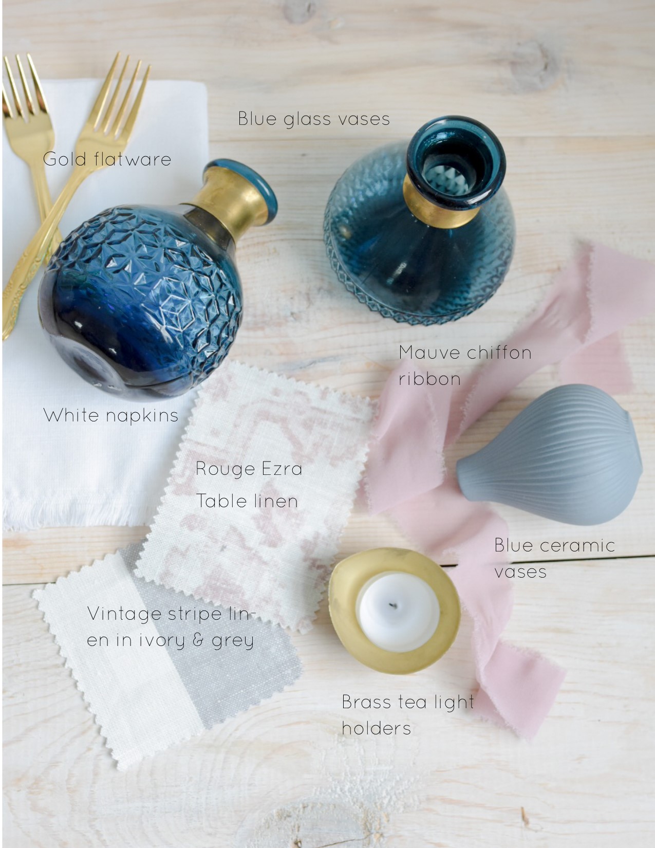
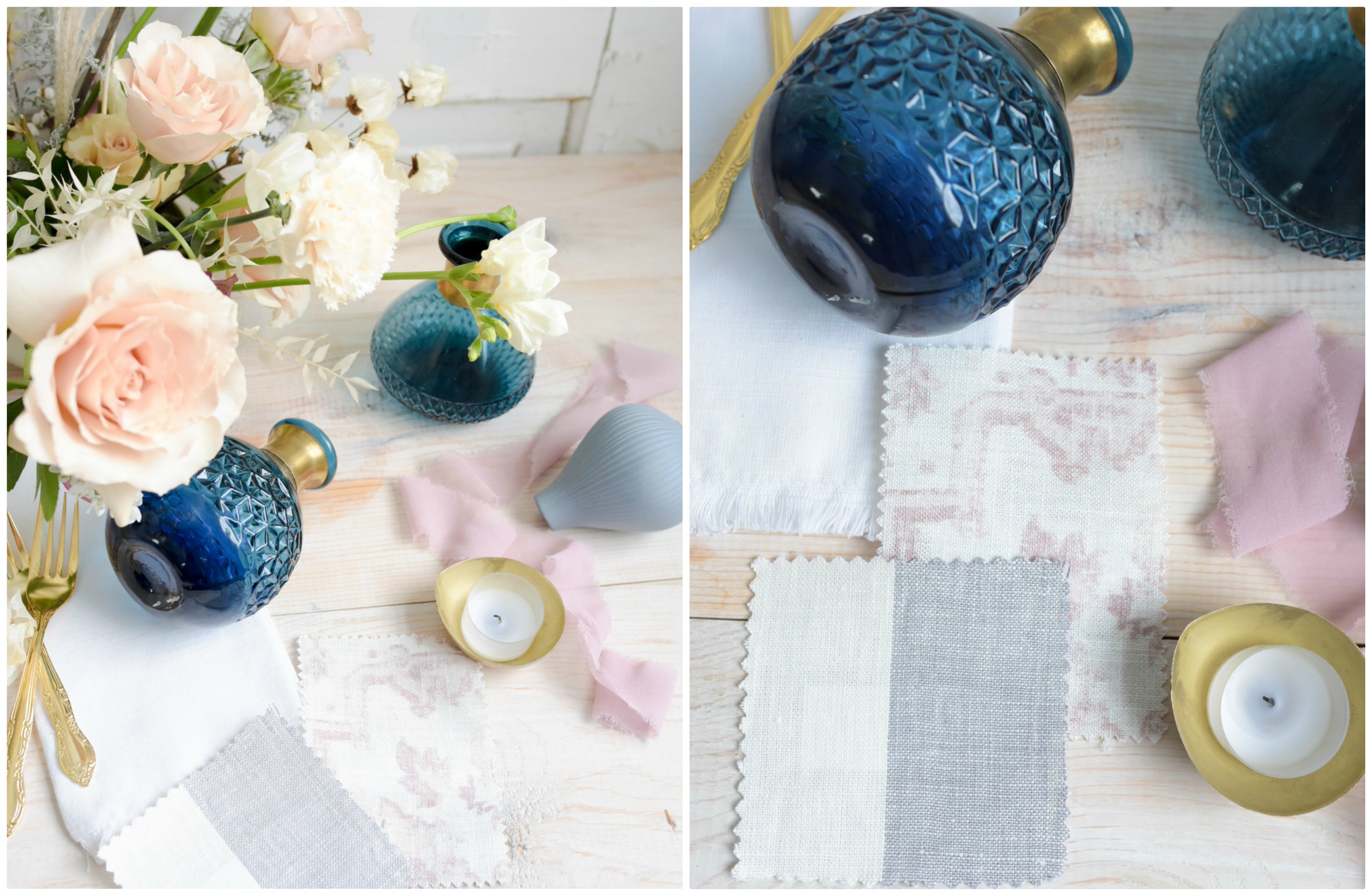
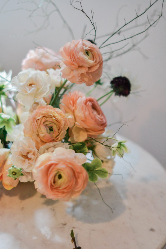
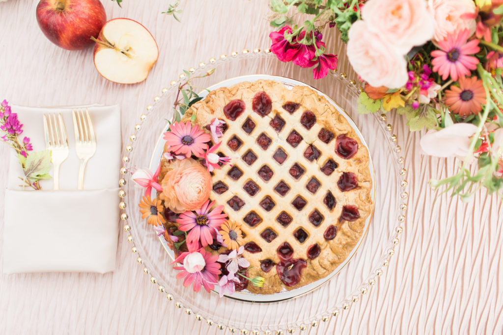
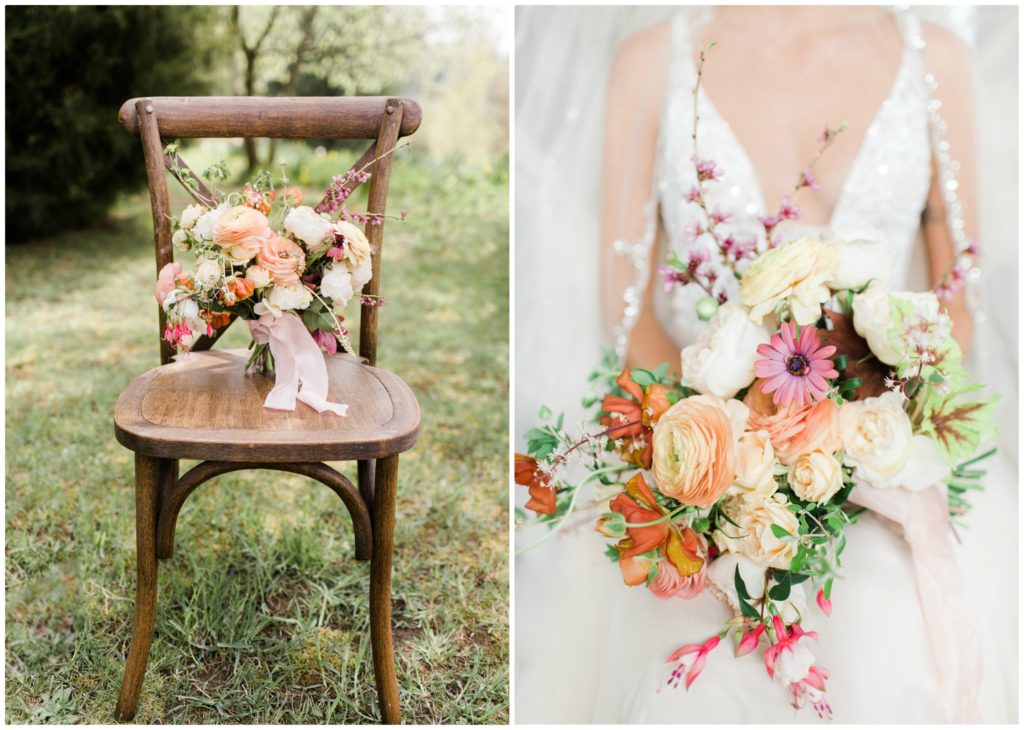
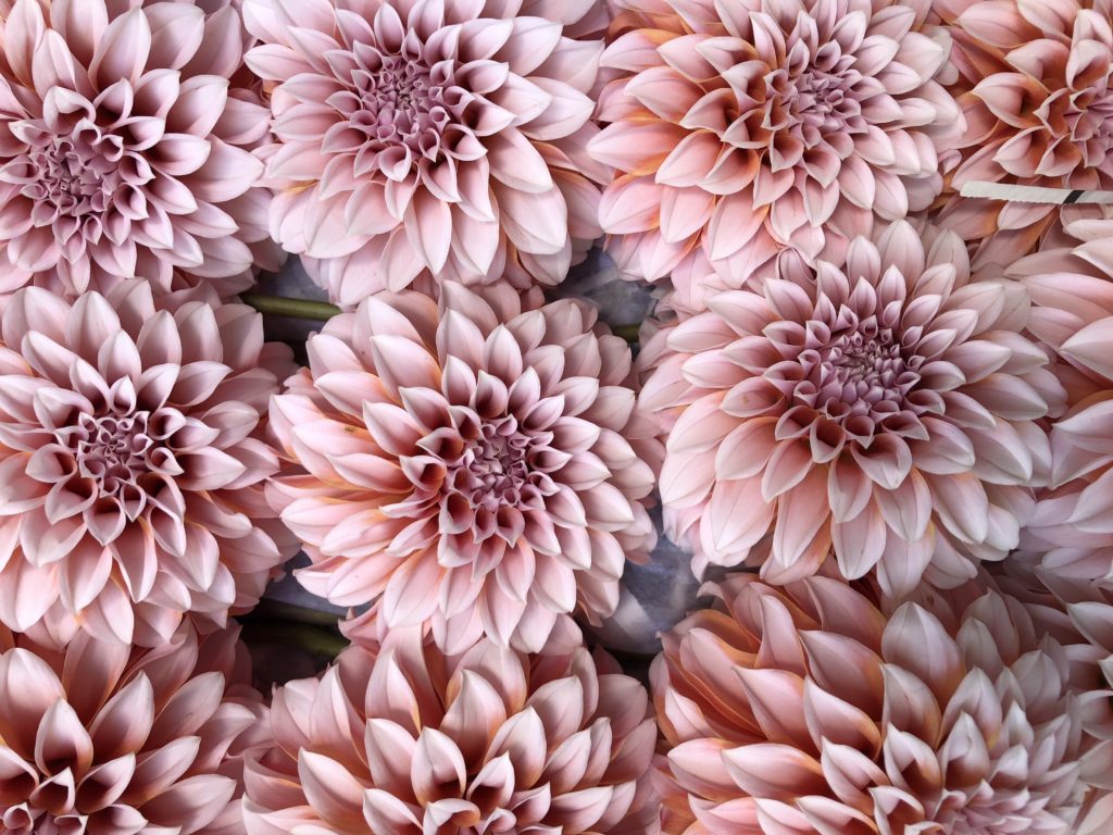
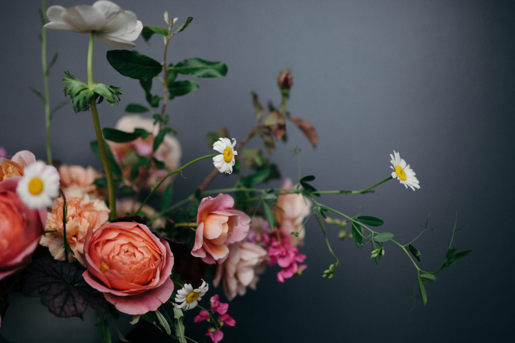
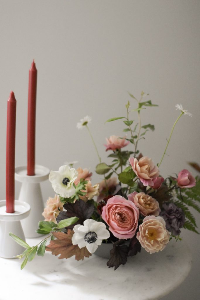
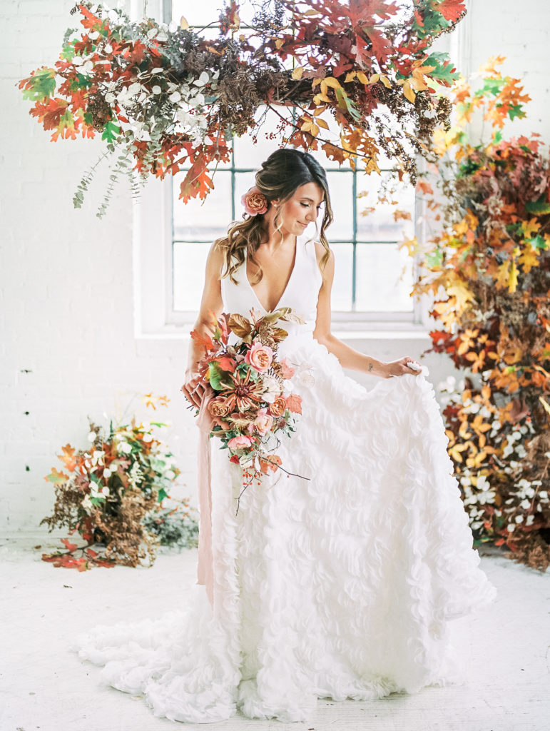
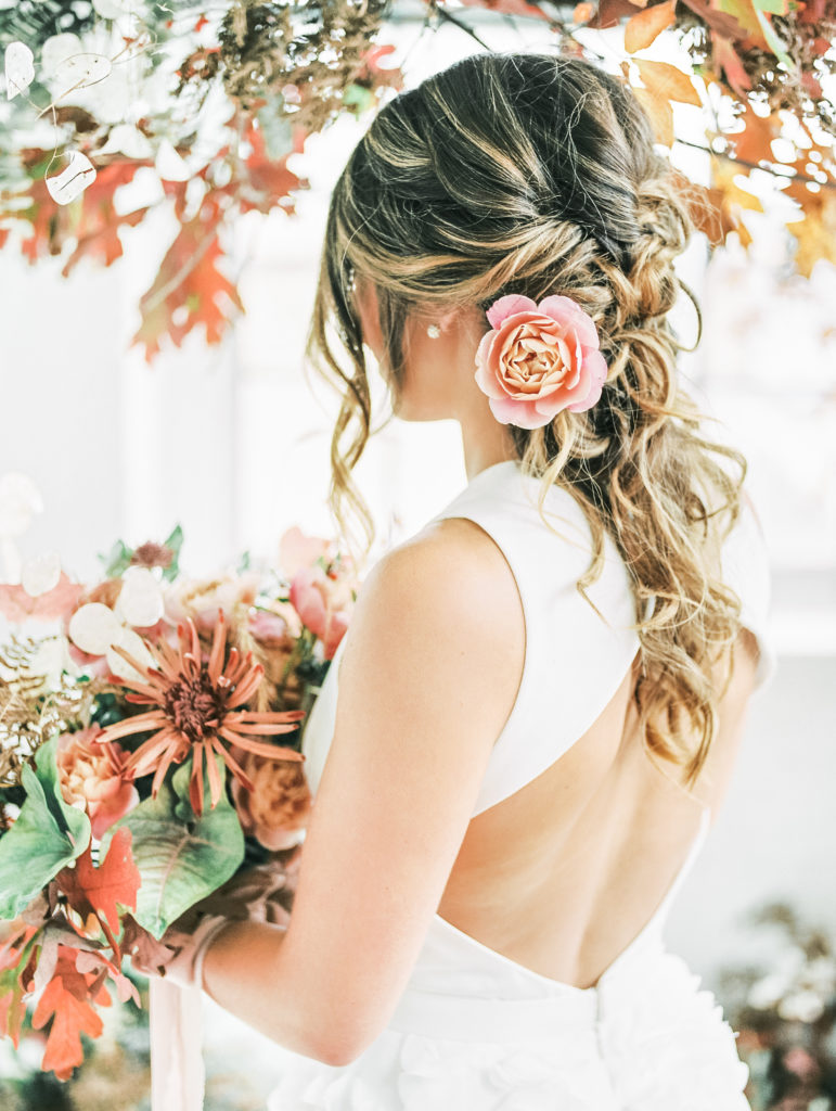
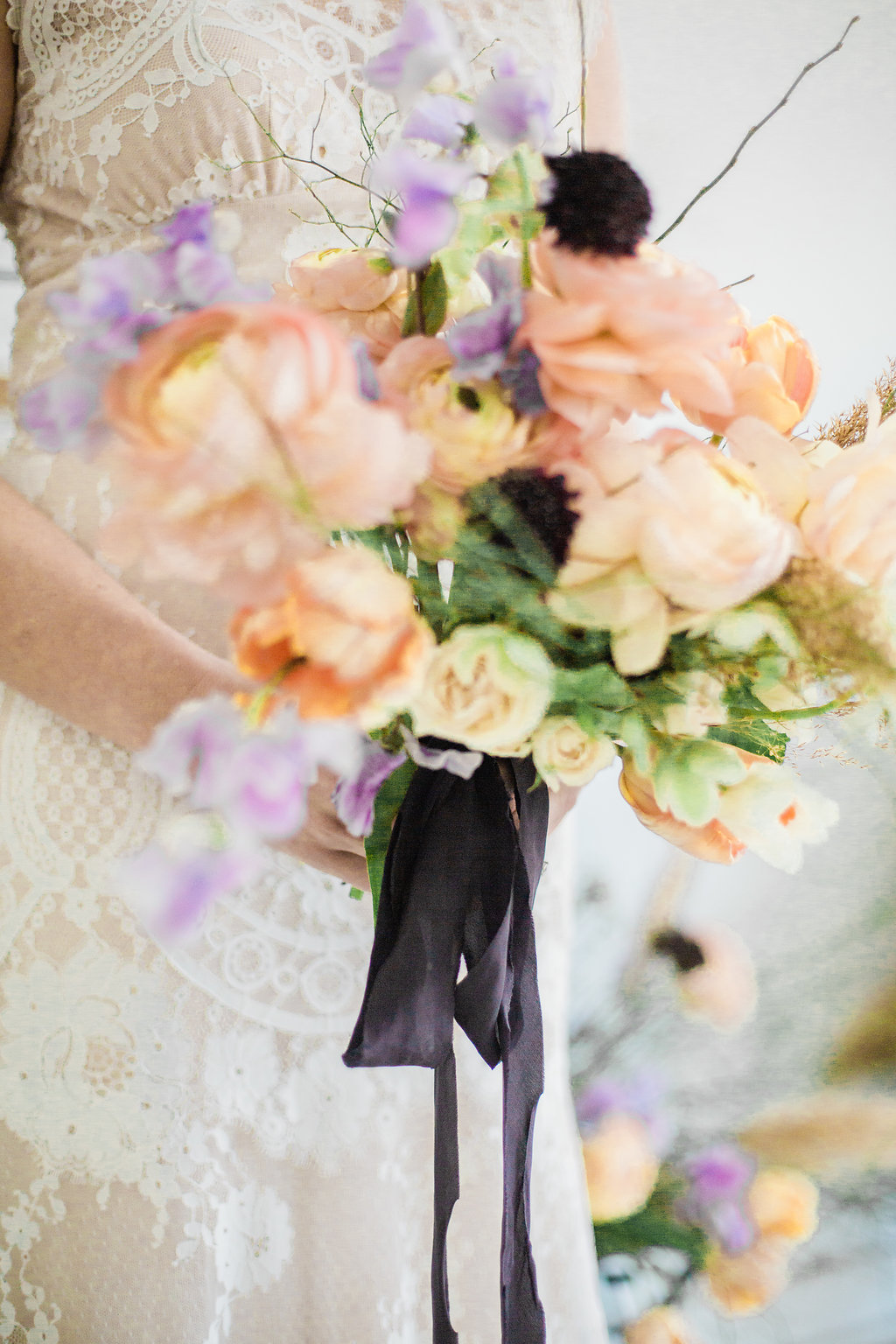
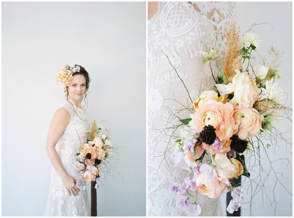
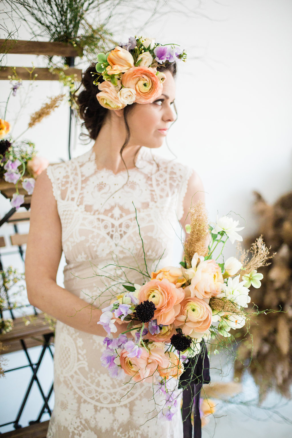
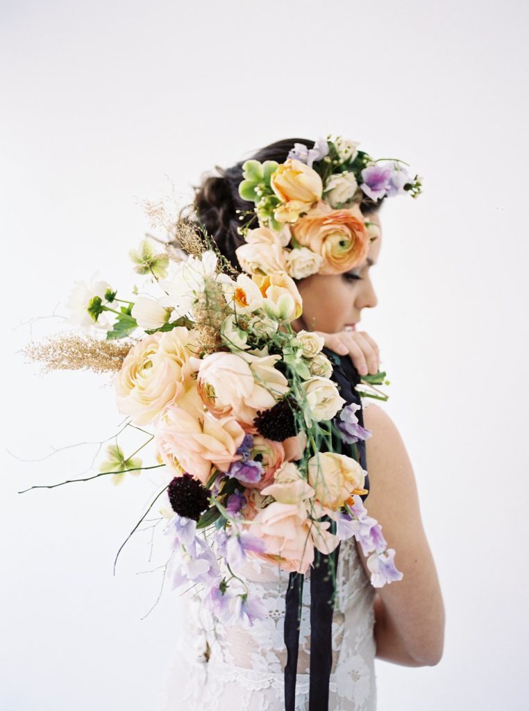
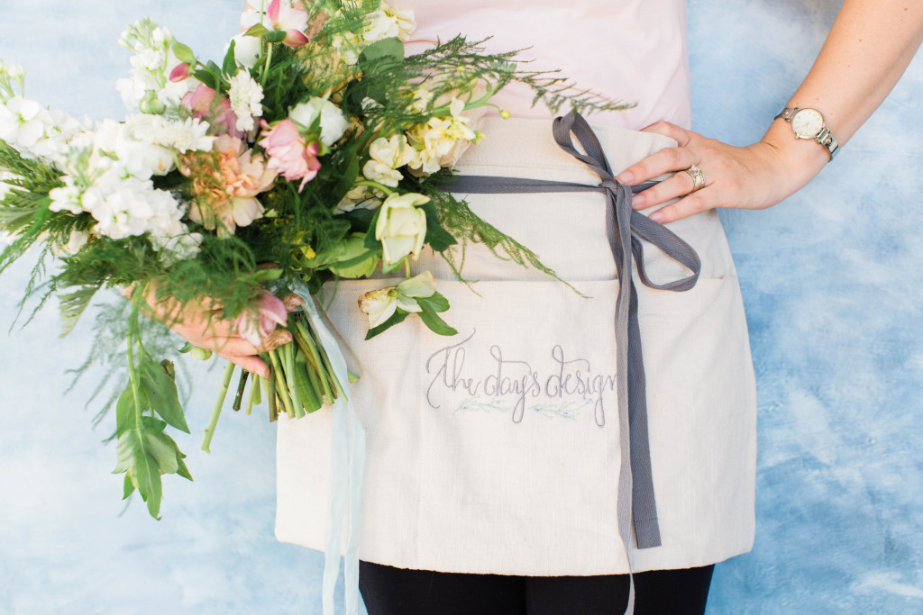
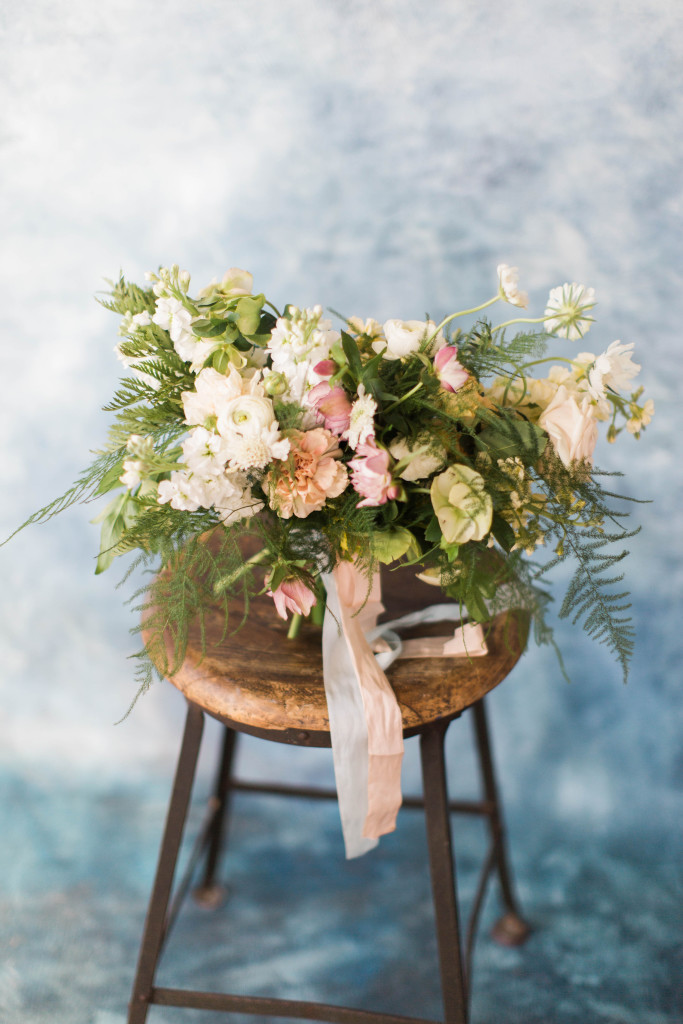
Now that we have our table base, let’s talk flowers. I want fluffy romance. Lots of texture pairs well with this in soft tones. Fresh whites with kisses of mauve and blush.
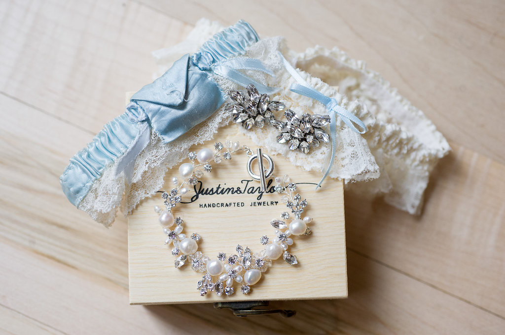
If we want to explore the color use into attire, let’s use a little blush and a little navy. Yes, we’ve seen it before but that doesn’t make it any else beautiful.
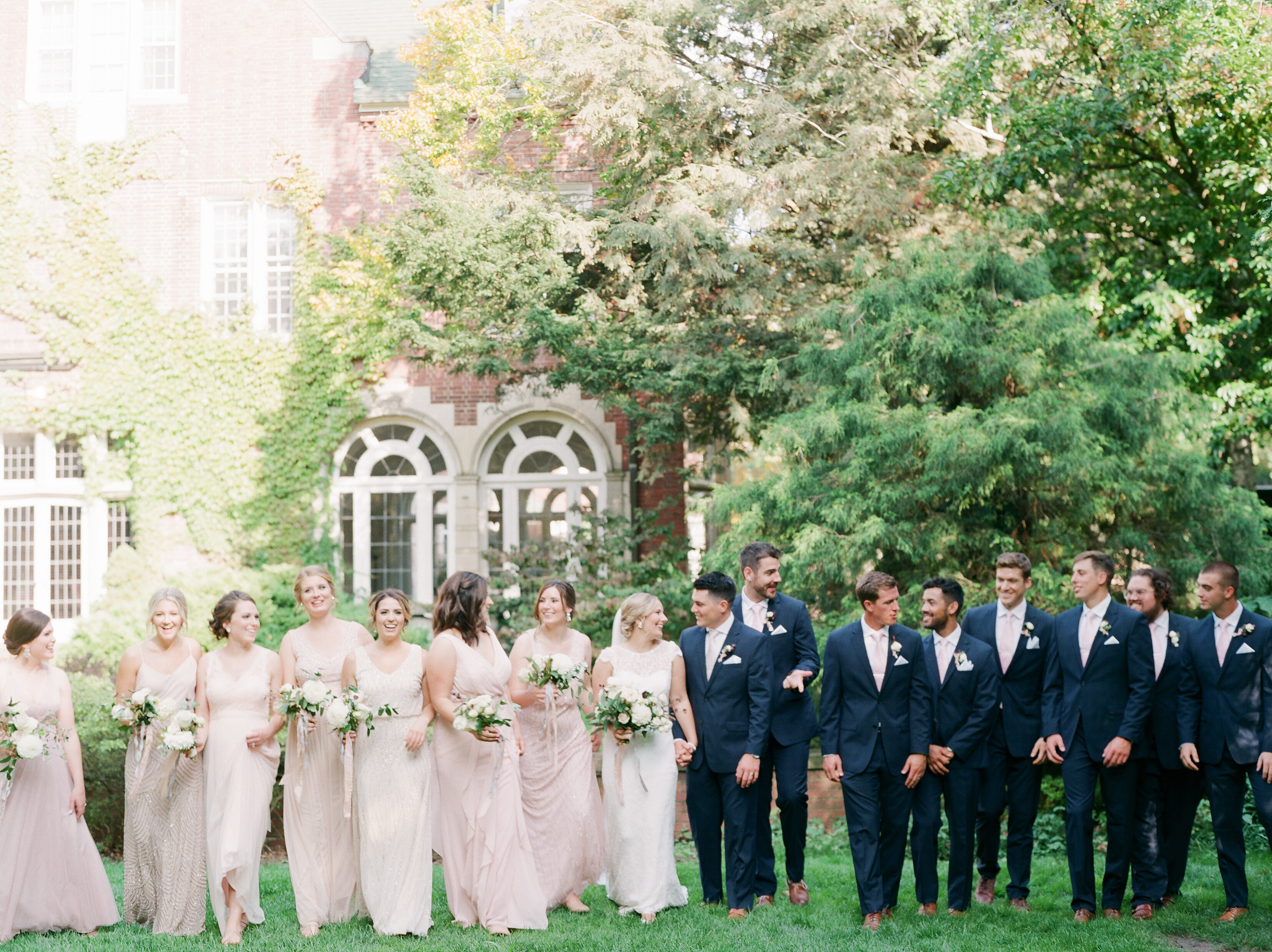
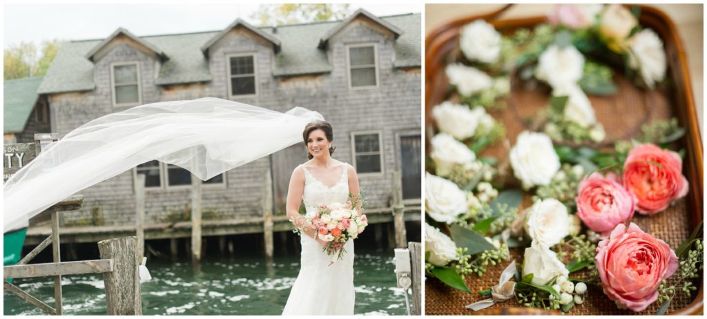
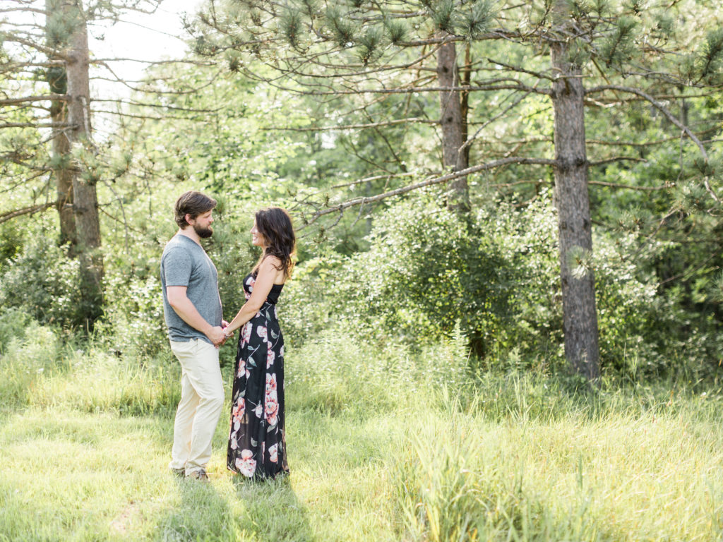
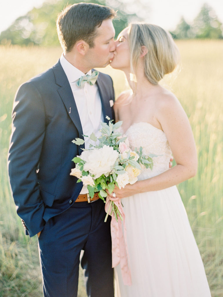
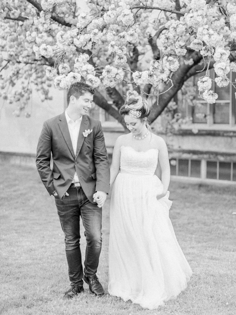
wedding party photograph: Kelly Sweet Photography
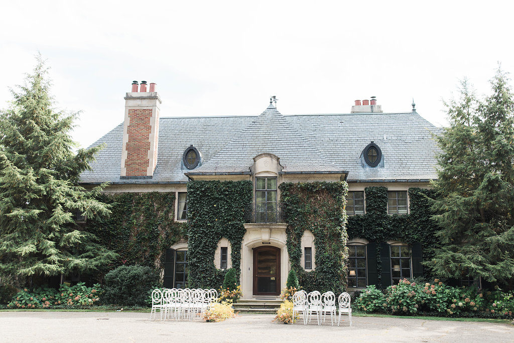
From ballroom, tent to barn… this color palette is so transitional. I hope you love it as much as I do!


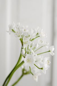
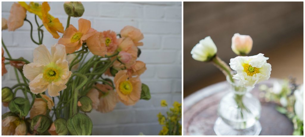
 I’ve coveted these little blooms in other designer’s work for years. I see it growing up fences and charming stone buildings. But, it’s not available in Michigan and does not have the tolerance for shipping, until now. This delicate little guy has been dried and is now the perfect little textural tidbit for an arrangement. The shape of the flower and overall look when placed in an arrangment is similar to a sweet pea, but we don’t have to worry about freezing them in the chilly January air and the color is more creamy, rather than a true crisp white. It warms up a winter arrangement, while still complimenting the landscape outside.
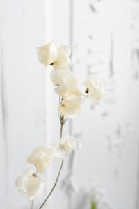
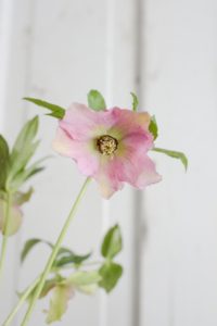 Also referred to as a Lenton Rose, these little guys are one of the first ones to spring to life in the garden. I’ve heard of them popping up and blooming through the snow, although I’ve personally never had that experience in my own garden. They are a great winter flower option though, not only because of the season, but also the subtle color they add to an arrangement. They’re mainly found in shades of pink, purple, green and white. The a single bloom usually contains more that one hue, creating a natural ombre effect and I simply love any flower that won’t define itself as just one color. Second bonus point for this little bloom, the colors are usually more on the antique scale which will appeal to those of us who like color, but not when it’s loudly screaming in your face.
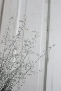 This is a new one to me, I saw it on my wholesaler’s list and thought I’d give it a try. I loved the texture and silvery color. Silvery green foliages are extremely popular, definately in the winter months, but really the entire year through. I’m always on the lookout for new ones to replace the ever popular dusty miller which everyone seems to love, but I personally have very little luck with. This is more delicate and textural adding just a touch of silver to an arrangement and making a really great, sturdy and linear, frosty option.
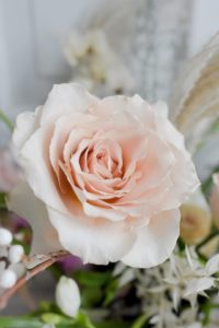 My favorite of the standard roses, the quicksand rose. She’s hardy, dependable and opens up beautifully. She’s the perfect neutral, blending with pinks, white, beige and more golden hued flowers. Its the subtle way that she takes control of an arrangment that really makes me love her even more. She’s popular any time of year, although her availablity becomes a little more scarce during the summer months, due to the high demand.
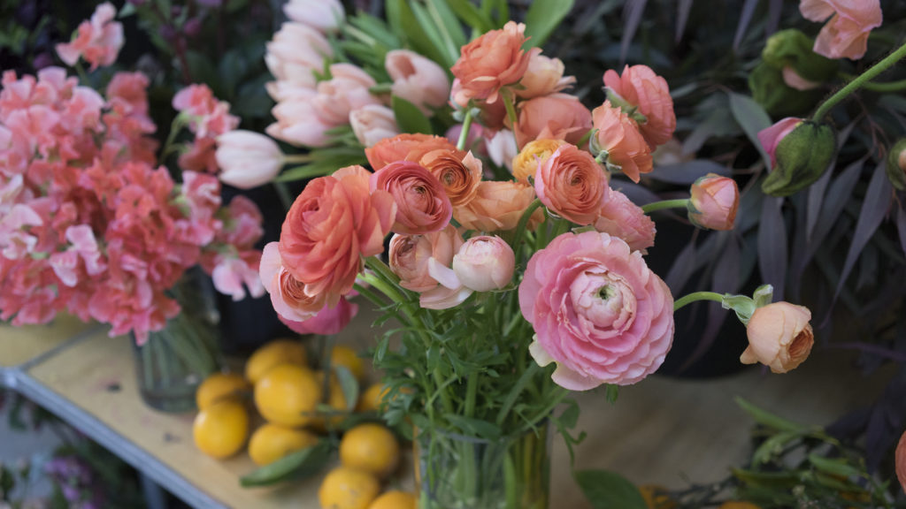


